


The feel of a room is greatly influenced by the psychology of color. It may add coziness, vibrancy, or peace to an area. This is why it is so important to choose the right colors for your house.
Let’s explore how different colors impact our feelings and moods. When designing your home, you can make better decisions if you are aware of the psychology of color.
Table of Contents
Psychology of Color in Interior Design
The study of the psychology of color looks at how colors influence our emotions, ideas, and actions. It explores the psychological and emotional effects of various shades.
How Colors Can Affect Mood and Behavior?
Colors have the ability to affect our emotions and actions. For instance, chilly colors like blue and green can have a calming effect on us, while warm colors like red and orange can energize us.
Every color has psychological associations of its own. In addition, yellow has a connection with cheerfulness and joy, while red has been linked with passion and excitement.
By being aware of this psychology of color connections, we can better establish the mood we want in a room.
Applying the Psychology of Color in Interior Design
Importance of Considering Color Psychology
When designing interior spaces, color psychology plays a role because colors have a major effect on people’s emotions as well as their actions.
Selecting the right shades can improve the overall experience and create the desired atmosphere.
How Different Colors Can Evoke Different Emotions and Feelings?
Every color has a unique effect on the mind. In this case, adding reds and oranges to a space can add warmth and vibrancy, while utilizing blue tones can encourage peacefulness and relaxation.
Designers can better create spaces that reflect the intended mood or purpose by being aware of these effects.
How to Use Color Psychology of Color Effectively in Interior Design?
Choosing cool, soft colors like lavender or light blue in a bedroom meant for rest can help create a calm environment that promotes sleep.
Warm colors like orange or red can encourage appetite and conversation in a dining room intended for lively get-togethers.
To boost focus and productivity in an office setting, earth tones or shades of green can help create a sense of state of equilibrium and concentration.
Specific Colors and Their Effects
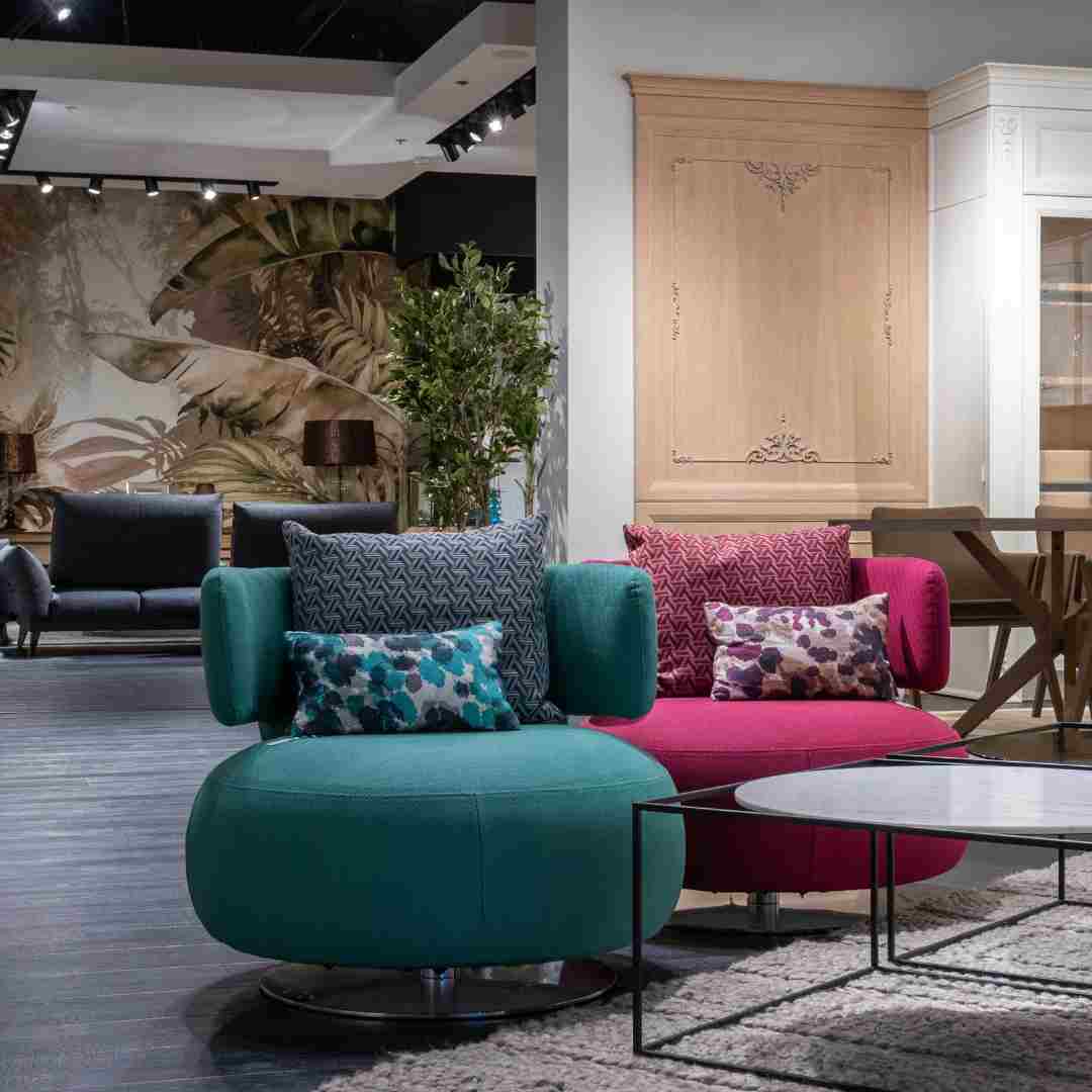
1. Warm Colors (e.g., Red, Orange, and Yellow)
The colors that follow are connected to vitality, comfort, and excitement.
The psychology of the color shade orange is frequently linked with zeal and creative thinking, whereas red may inspire feelings of passion and excitement. Yellow is a color linked to joy and hope.
- How to use: Use them in rooms like living rooms or kitchens where warmth and energy are desired. Yet, try not to use too much intensity in smaller areas.
2. Cool Colors (e.g., Blue, Green, and Purple)
Cool colors are recognized for their ability to relax and comfort.
Green is a color that represents growth and harmony, while blue frequently relates to peace and relaxation. A feeling of creativity and luxury can be stimulated with purple.
- How to use: Include them in spaces designed for unwinding, like reading places or bedrooms. They can also be applied in areas like home offices where concentration and focus are required.
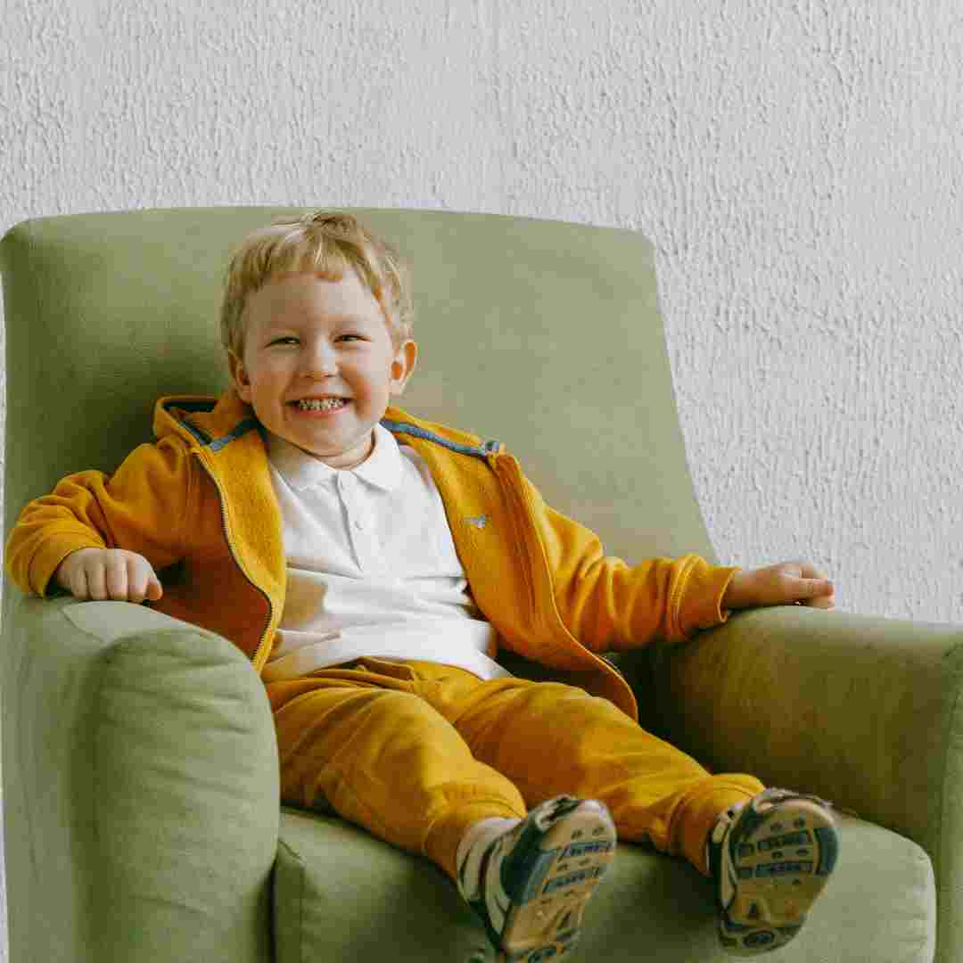
3. Neutral Colors (e.g., White, Beige, Gray)
In interior design a shade of gray offers versatility and a feeling of balance psychology of color.
Beige provides warmth and subtlety, gray may indicate sophistication and elegance, and white can represent purity and simplicity.
How to use: They provide a background for other components in the space, making the furniture and décor the focal points. They add harmony and peace of mind to any space because they are adaptable and work well in any setting.
Case Studies and Examples
The practical implementation of the psychology of color can be seen in actual interior design projects.
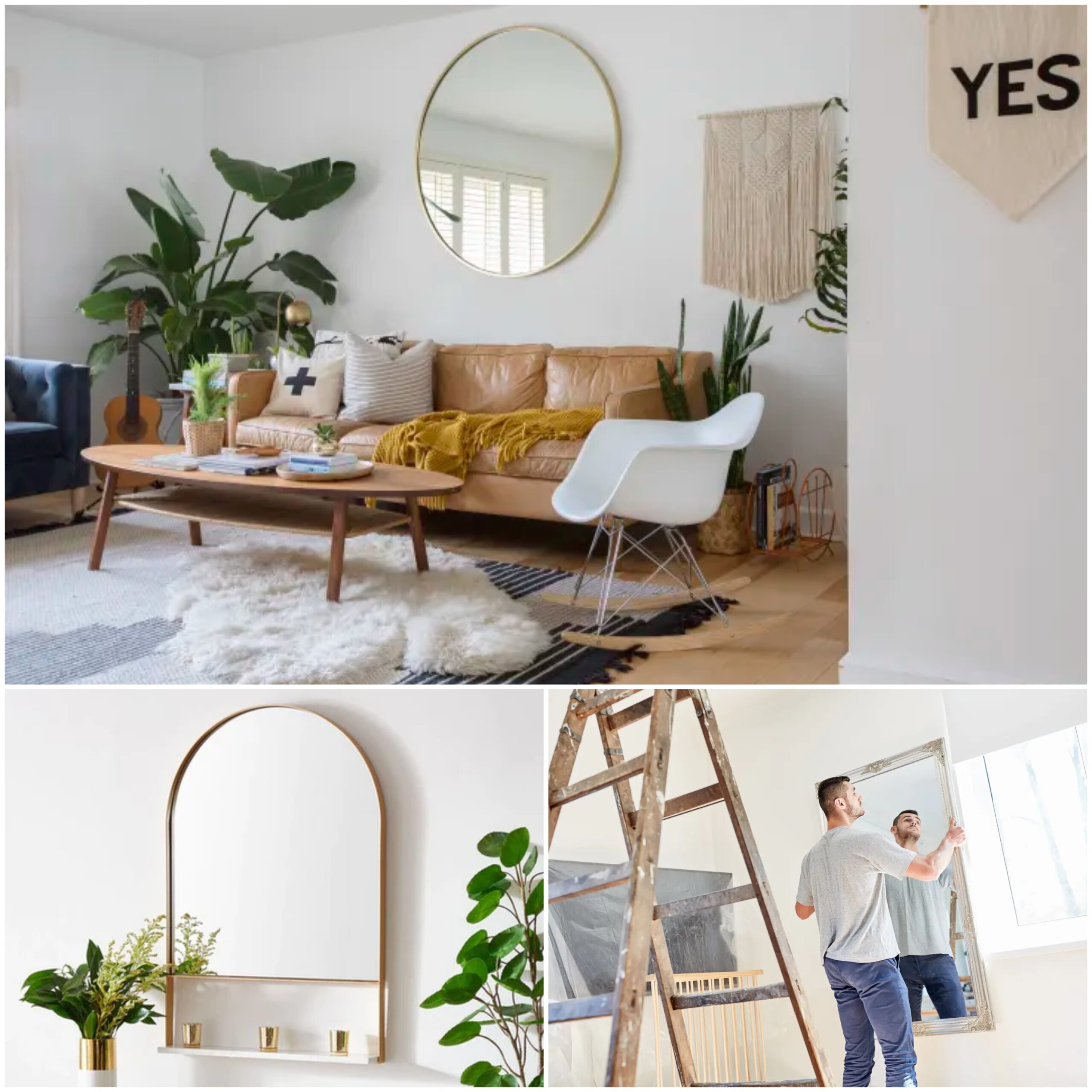
In this case, the atmosphere becomes bright and vibrant in a cozy and welcoming living room decorated with quiet orange, yellow, and red tones.
These cozy colors promote conversation and develop a friendly atmosphere in situations.
On the other hand, calm colors like blue and green create a relaxing haven in the bedroom that encourages rest and peace.
The peaceful atmosphere created by the calming shades encourages sound sleep. These examples prove how interior design can dramatically affect the mood and atmosphere of a space by carefully selecting color schemes.
Read: Hidden Costs DESTROYING Your Budget? Fix Your Home for FREE (Almost)
Practical Tips for Color Psychology
Here are some useful pointers to think about when integrating the psychology of color in interior design,
Select Colors Based on the Desired Mood or Ambiance
Take into consideration the atmosphere or mood you wish to create when selecting colors for a room.
Try to use warm colors like soft reds, oranges, or yellows if you want to create a feeling of comfort and invitingness.
Yet think about using cool colors like blue or green tones to encourage calm and relaxation.
Balance and Combine Different Colors
A design scheme must balance and harmonize various colors.
Vibrant shades should not overpower the space by combining too many; instead, they should be paired with neutral tones to create visual interest without strengthening the senses.
Similarly, an organized and balanced look can be achieved by pairing a bold accent color with soothing neutrals like white, beige, or gray.
Experiment with Color
Try different colors to see what suits your room the best. Do not be scared to experiment psychology of color.
Start by adding modest drops of color with throw pillows, area rugs, or artwork as accent pieces.
This lets you experiment with the ways in which colors blend together in the space before settling on larger design components like wall paint or furniture.
The natural light in the room should also be taken seriously as it may affect the appearance of color.
Trying out various lighting setups will help you in selecting the ideal color scheme that complements your room’s overall style.
You can successfully use color psychology in your interior design projects and create spaces that evoke the desired mood and ambiance by paying attention to these useful tips.
Frequently Asked Questions
1. Why are colours important in interior design?
Colors are important in interior design because they create an atmosphere and mood that affect how a space feels overall.
They produce particular feelings and actions, which allows designers to create spaces that appeal to residents. Perfect color selections can improve a space’s usability, beauty, and overall well-being.
2. What is the 3 color rule in interior design?
To create harmony and balance in a room’s color scheme, the three-color rule in interior design recommends using three primary colors.
A dominant color, a secondary color for visual interest, and an accent color to provide contrast are usually the three colors that make up this color scheme.
3. What is color philosophy in interior design?
In interior design, color philosophy or psychology of color refers to the beliefs and principles that direct the use of color to produce spaces that are meaningful and harmonious.
The goal of color philosophy is to design spaces that reflect the intended mood or message, improve functionality, and stimulate particular moods.
4. How do I choose an interior design color?
Think about the tone and ambiance you want to create in the room when selecting a color for your interior design.
Consider the room’s purpose as well as the effects that different colors can have on feelings and actions.
To make sure the selected color appears correctly, try out different color samples and take note of the background light. To create a color scheme that is both integrated and pleasing to the eyes, take advantage of your personal taste as well as existing furnishings.
5. What is most popular interior color?
Because of their flexibility and ability to act as a backdrop for other design elements, neutral tones like white, beige, and gray are frequently chosen.
Warm tones like soft earthy colors and muted pastels are still popular for adding warmth and coziness to a space, and shades of blue and green are also popular choices for creating calming as well as calm environments.
Bottom Line
Our perceptions of interior spaces are greatly affected by the psychology of color.

Not only can designers create visually pleasing spaces, but they can also create environments that promote comfort, productivity, and well-being by carefully choosing and balancing colors according to desired moods and ambiance.

Ultimately, color psychology in interior design lets us produce environments that are not only visually beautiful but also meaningful and expanding to live in.
Read: Forget Expensive Alarms! DIY Security Hack Goes VIRAL